Data Exploration and Cleaning
Contents
Data Exploration and Cleaning#
Now let’s dive in a bit deeper and have a look at some code snippets!
The source code for this tutorial is located in
examples/1-binary-stroke-prediction and consists of a few numbered scripts as
well as the helpers module which contains a function for loading and
cleaning the dataset. We will begin by looking at the helpers module.
Textual Data Inspection#
First, we load the data from the *.csv file using pandas.read_csv()
data = pd.read_csv('healthcare-dataset-stroke-data.csv')
which returns a pandas.DataFrame. Objects of this type come with a
few methods for inspecting them in textual form already:
print(data.dtypes)  # datatype of each column
print(data.head)    # table with first few lines of the data
print(data.count()) # count valid datapoints - something going on with 'bmi'
print(data['bmi'])  # print column - 'bmi' contains floats and 'NaN'
The pandas.DataFrame.dtypes() method yields
id                     int64
gender                object
age                  float64
hypertension           int64
heart_disease          int64
ever_married          object
work_type             object
Residence_type        object
avg_glucose_level    float64
bmi                  float64
smoking_status        object
stroke                 int64
dtype: object
with object indicating string category labels. This can be seen explicitly
with the pandas.DataFrame.head() command, which outputs
<bound method NDFrame.head of          id  gender   age  hypertension  heart_disease ever_married      work_type Residence_type  avg_glucose_level   bmi   smoking_status  stroke
0      9046    Male  67.0             0              1          Yes        Private          Urban             228.69  36.6  formerly smoked       1
1     51676  Female  61.0             0              0          Yes  Self-employed          Rural             202.21   NaN     never smoked       1
2     31112    Male  80.0             0              1          Yes        Private          Rural             105.92  32.5     never smoked       1
3     60182  Female  49.0             0              0          Yes        Private          Urban             171.23  34.4           smokes       1
4      1665  Female  79.0             1              0          Yes  Self-employed          Rural             174.12  24.0     never smoked       1
...     ...     ...   ...           ...            ...          ...            ...            ...                ...   ...              ...     ...
5105  18234  Female  80.0             1              0          Yes        Private          Urban              83.75   NaN     never smoked       0
5106  44873  Female  81.0             0              0          Yes  Self-employed          Urban             125.20  40.0     never smoked       0
5107  19723  Female  35.0             0              0          Yes  Self-employed          Rural              82.99  30.6     never smoked       0
5108  37544    Male  51.0             0              0          Yes        Private          Rural             166.29  25.6  formerly smoked       0
5109  44679  Female  44.0             0              0          Yes       Govt_job          Urban              85.28  26.2          Unknown       0

[5110 rows x 12 columns]>
As we can see, some categorical columns contain string labels, e.g.
Yes/No in the column ever_married, while others are labelled with
integers, e.g. 0/1 in the column hypertension, leading to the
indicated datatypes.
The pandas.DataFrame.count() method counts the valid datapoints in each
column, ignoring NaN values:
id                   5110
gender               5110
age                  5110
hypertension         5110
heart_disease        5110
ever_married         5110
work_type            5110
Residence_type       5110
avg_glucose_level    5110
bmi                  4909
smoking_status       5110
stroke               5110
We can see that the variable bmi contains 4909 entries as opposed to
5110 for the other columns. When printing it, we can see the NaN values
dtype: int64
0       36.6
1        NaN
2       32.5
3       34.4
4       24.0
        ...
5105     NaN
5106    40.0
5107    30.6
5108    25.6
5109    26.2
Name: bmi, Length: 5110, dtype: float64
corresponding to N/A entries in the original *.csv file.
Data Cleaning#
There are different ways of handling missing data such as these NaN
values. One option is imputation where the missing values are replaced
with other plausible values, such as the mean of the other values.
Here, we are just going to drop the corresponding datapoints entirely:
data.dropna(inplace=True)
inplace=True means that the existing pandas.DataFrame data
itself is modified and the datapoints containing missing values are removed.
Otherwise, data would be left unaltered and a new copy would be returned
with the affected datapoints removed.
Let’s also delete the id column:
data.drop(columns=['id'], inplace=True)
Now that the dataset is slimmed down to the relevant information, let’s continue by bringing the variable names and the categorical string labels into a consistent form that is instantly informative when later plotting the data:
# clean up variable names
rename_dict = {'Residence_type': 'residence_type'}
data.rename(columns=rename_dict, inplace=True)

# clean up datatypes
replace_dict = {
    'ever_married': {'No': 'no', 'Yes': 'yes'},
    'gender': {
        'Female': 'female',
        'Male': 'male',
        'Other': 'other'
    },
    'heart_disease': {0: 'no', 1: 'yes'},
    'hypertension': {0: 'no', 1: 'yes'},
    'residence_type': {
        'Urban': 'urban',
        'Rural': 'rural'
    },
    'smoking_status': {
        'Unknown': 'unknown',
        'never smoked': 'never',
        'formerly smoked': 'formerly'
    },
    'work_type': {
        'Govt_job': 'govt',
        'Never_worked': 'never',
        'Private': 'private',
        'Self-employed': 'self'
    },
    'stroke': {0: 'no', 1: 'yes'}
}
data.replace(replace_dict, inplace=True)
The first part just converts the variable name to lower-case, consistent with
the other variable names. Similar lower-case consistency is also implemented
in the second part for the names of the different categorical classes.
However, the second part also replaces the integer values 0 and 1
with their slightly more expressive text counterparts 'no' and 'yes'.
While such string labels are of course not adequate for feeding into a
neural network, this is just a tad more intuitive in the plots we are about
to create in a moment. Bringing them into a form that can be handled by the
network will be done afterwards as part of the preprocessing and input pipeline.
It is always handy to have lists with the names of the feature and target variables at hand, so let’s create these:
# create lists of variable names
vars = list(data)
target = 'stroke'
features = vars.copy()   # make a copy to protect the original list
features.remove(target)  # from being modified by the 'remove' statement
print(target)
print(features)
print(vars)
Remember to protect vars by making features a copy of it!
Finally, let’s check that spellbook correctly identifies each variable as
categorical or continuous. This is used in the high-level plotting
functions in spellbook.plot for automatically choosing the adequate
visual representation for each variable, e.g. barcharts or histograms for
1D/univariate plots and heatmaps, multiple horizontal histograms or
scatterplots for 2D/bivariate/correlation plots:
sb.plotutils.print_data_kinds(data)
correctly returns
variable            kind
------------------------
gender               cat
age                 cont
hypertension         cat
heart_disease        cat
ever_married         cat
work_type            cat
residence_type       cat
avg_glucose_level   cont
bmi                 cont
smoking_status       cat
stroke               cat
Data Visualisation#
Now, finally, let’s start plotting the dataset. In this section we’ll walk
through the code in 1-plot.py.
It begins by loading and cleaning the data using the helper function introduced before:
import helpers
data, vars, target, features = helpers.load_data()
Individual univariate plots can be created with spellbook.plot.plot_1D(),
which creates and returns a matplotlib.figure.Figure object, and
spellbook.plot.save(), which saves a figure to a file:
fig = sb.plot.plot_1D(data=data, x='stroke', fontsize=14.0)
sb.plot.save(fig, filename='stroke.png')
A slightly more involved example, with both plotting and saving chained after one another, is:
sb.plot.save(
    sb.plot.plot_1D(
        data = data,
        x = 'avg_glucose_level',
        xlabel = 'Average Glucose Level',
        statsbox_args = {
            'text_args': {'backgroundcolor': 'white'}
        }
    ),
    filename='avg_glucose_level.png'
)
These commands create plots of the target variable stroke (Figure 12) and
one of the feature variables, avg_glucose_level (Figure 13):
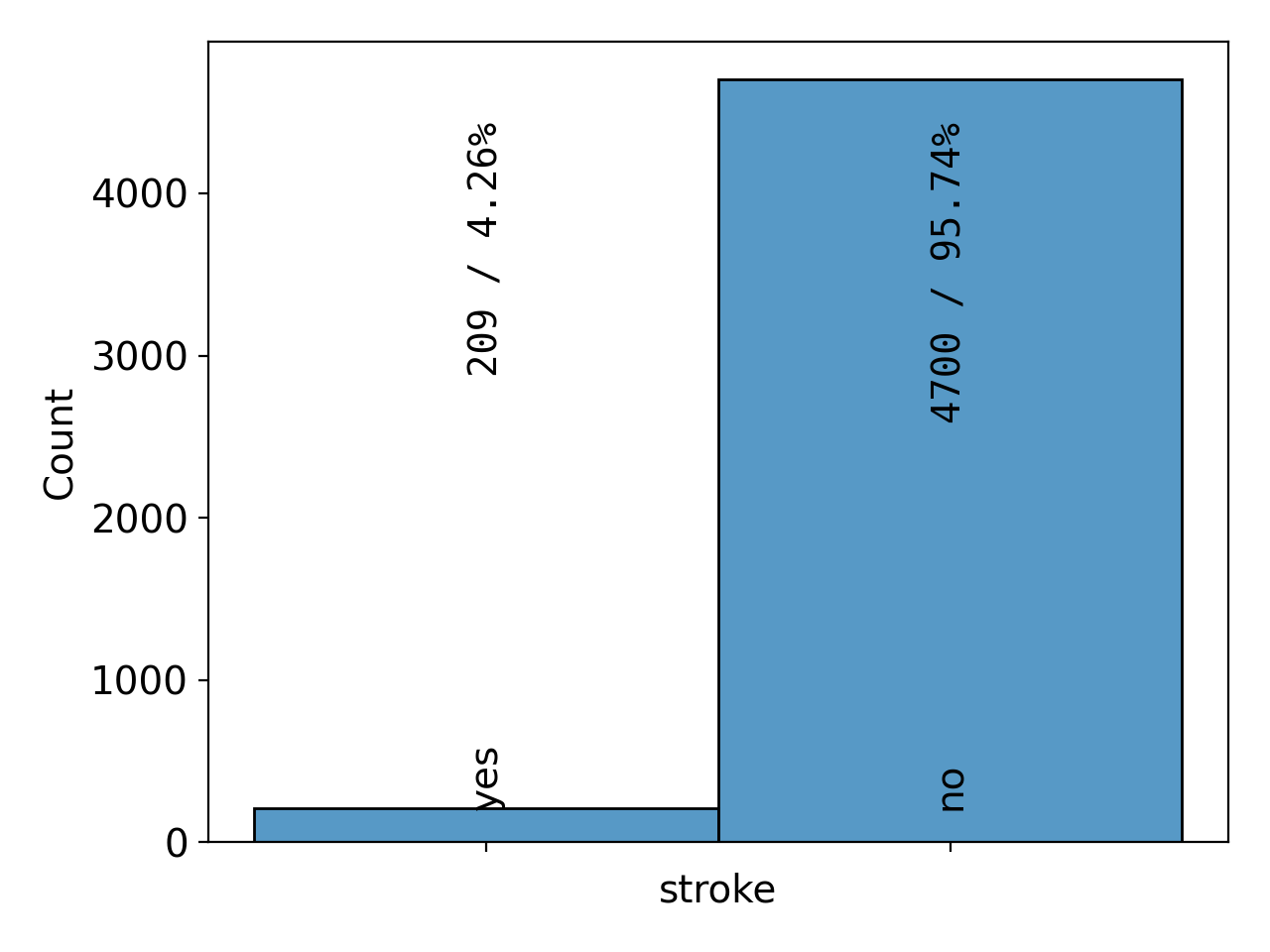
Figure 12: barchart# |
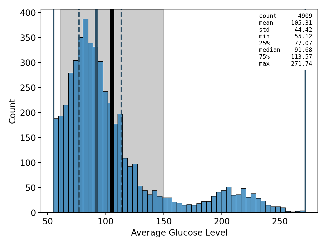
Figure 13: histogram# |
The type of plot is determined automatically by spellbook.plot.plot_1D()
according to the kind of the variable: For categorical variables,
spellbook.plot1D.heatmap() is called, and for continuous variables,
spellbook.plot1D.histogram(). The histogram comes with a few additional
visual elements indicating descriptive statistics, such as the mean, median,
standard deviation, quantiles, as well as a box in which the numerical
values of all the statistics are given. All these elements can be switched on
and off individually.
It is also possible to plot multiple variables arranged in a grid:
# plot all target and feature distributions
sb.plot.save(
    sb.plot.plot_grid_1D(
        nrows=3, ncols=4, data=data, target=target, features=features,
        stats=False, fontsize=11.0
    ),
    filename='variables.png'
)

# plot a subset of the feature variables
sb.plot.save(
    sb.plot.plot_grid_1D(
        nrows=2, ncols=3, data=data,
        features=['age', 'hypertension', 'heart_disease',
                  'bmi', 'avg_glucose_level', 'smoking_status'],
        stats=False, fontsize=11.0
    ),
    filename='variables-health.png'
)
The first command creates a grid plot of all variables, both the target variable as well as all of the feature variables (Figure 14). The target variable is shown first and highlighted in orange. The second command creates a plot of a subset of the feature variables (Figure 15). The statistics boxes are deactivated so as to not overcrowd the plots.
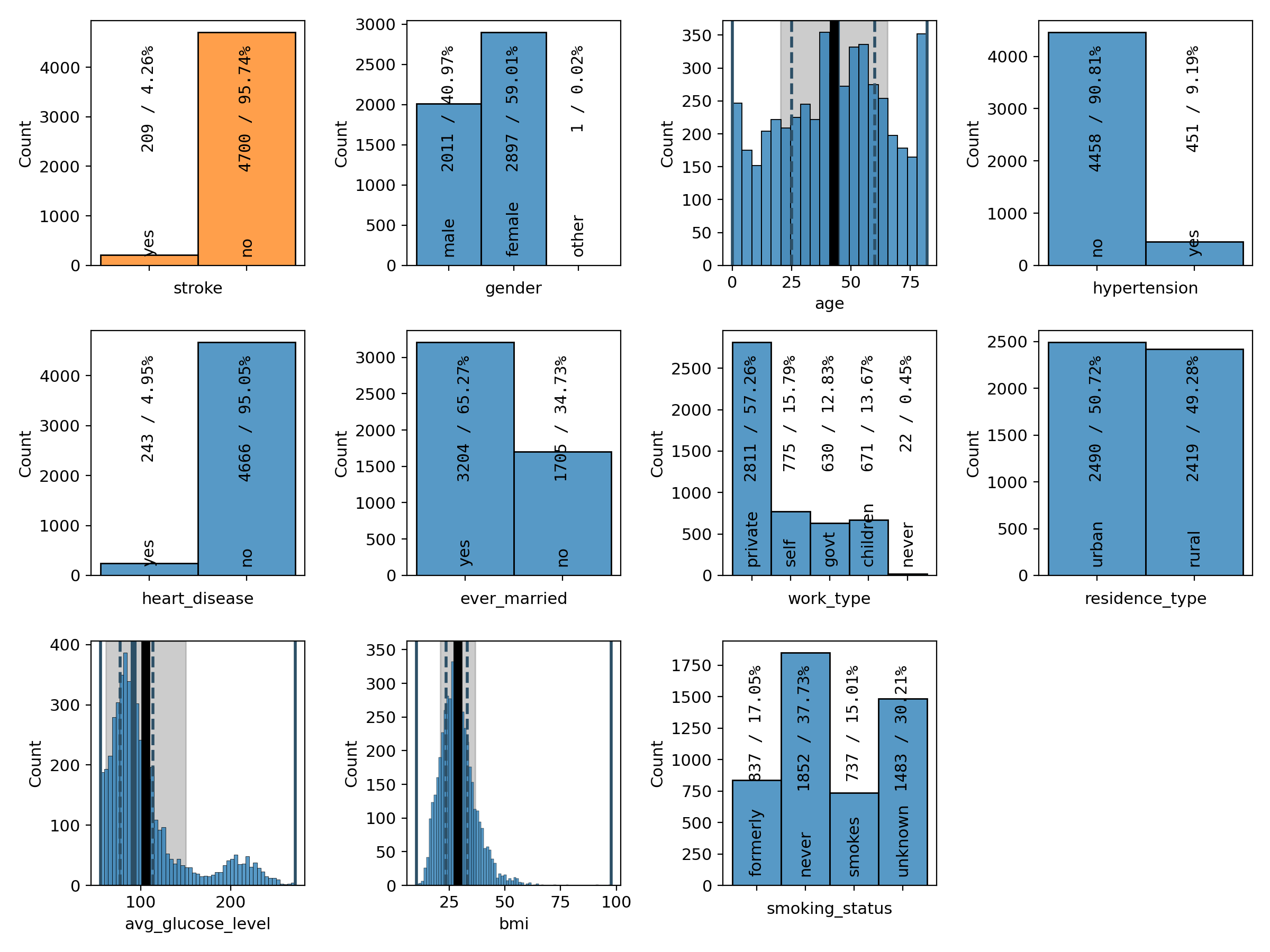
Figure 14: grid plot of the target and all feature variables# |
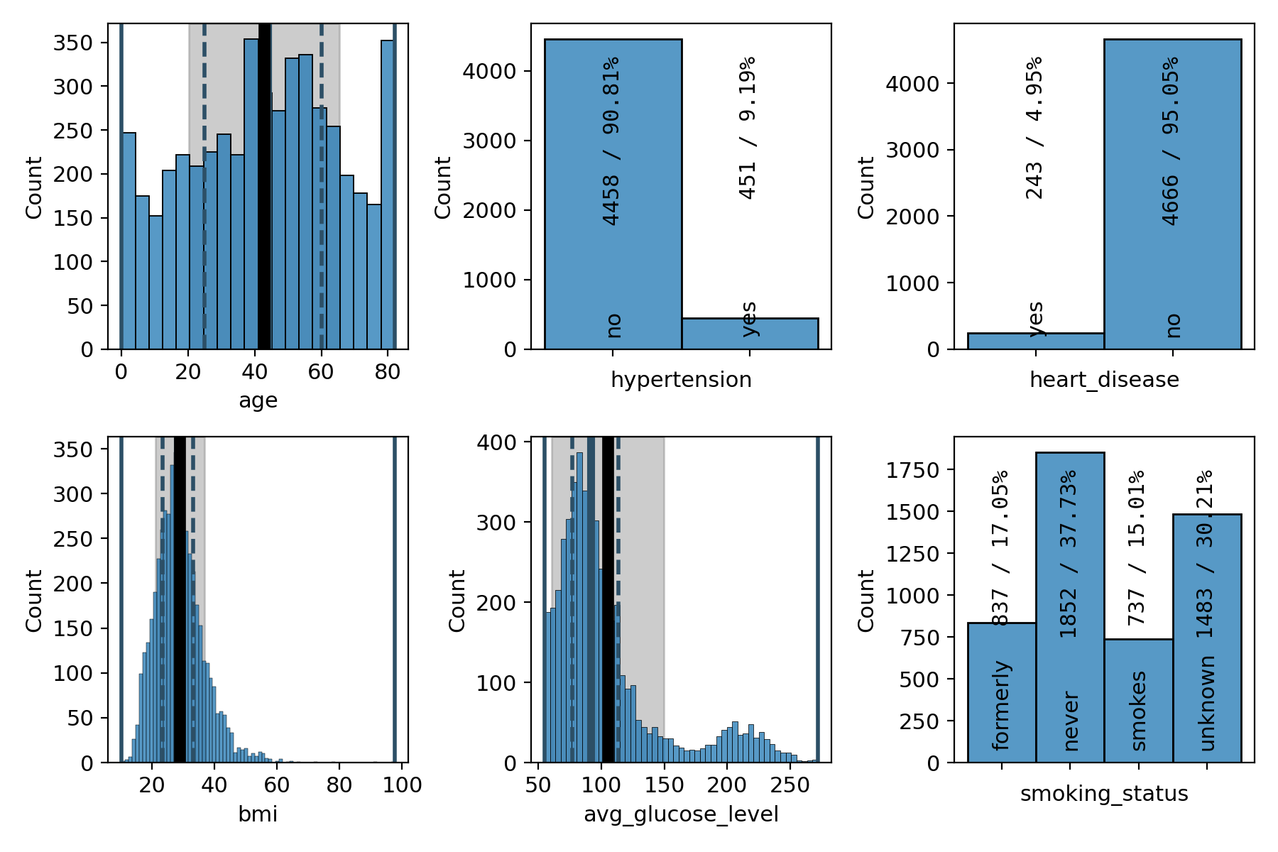
Figure 15: grid plot of a subset of the feature variables# |
As we have already seen in the summary version on the previous page, there are far fewer patients with a stroke than without, making the dataset imbalanced. We can also see that a majority of 60% of the patients are female and that the age distribution is slightly concentrated at medium ages between 40 and 60 and falls off a bit towards the edges, with the notable exception of the first and last bin. 9% of the patients have hypertension and 5% of them suffer from a heart condition. About two thirds of them are married or have been married at least once. The majority, about 57%, work in the private sector. The dataset is pretty balanced with regard to where the patients live (urban or rural areas). The distribution of the average glucose level shows a secondary peak just above 200, pulling the mean slightly above the median. The BMI distribution has a slight tail on the right-hand side, but is otherwise centered at around 30, which is the boundary between the overweight and moderately obese (class 1) categories. Finally, about 38% of the patients have never smoked, 17% and 15% are former and current smokers, respectively, and for the remaining 30%, it is not known if they do or do not smoke.
This is all good and fine, but more interesting than univariate plots are bivariate plots showing the correlations between different variables. So let’s go ahead and plot some! Let’s start with single plots containing just one correlation:
sb.plot.save( # default: no descriptive statistics
    sb.plot.plot_2D(data=data, x='age', y=target, fontsize=14.0),
    filename='age-corr.png'
)
sb.plot.save( # boxes with descriptive statistics included
    sb.plot.plot_2D(
        data=data, x='age', y=target, fontsize=11.0,
        histogram_args = [
            dict(show_stats=True, statsbox_args={'alignment': 'bl'}),
            dict(
                show_stats = True,
                statsbox_args = {
                    'y': 0.96,
                    'text_args': {
                        # RGBA white with 50% alpha/opacity
                        'backgroundcolor': (1.0, 1.0, 1.0, 0.5)
                    }
                }
            )
        ]
    ),
    filename='age-corr-stats.png'
)
Correlations between a continuous variable on the x-axis and a categorical variable on the y-axis are shown as a sequence of histograms for each of the y-categories, plotted one above the other. The first example (Figure 16) is the default configuration where the boxes indicating the descriptive statistics are suppressed. The second version (Figure 17) shows how to activate and configure them.
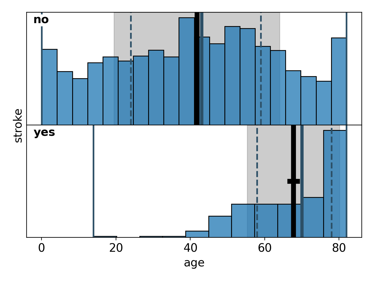
Figure 16: default bivariate histogram# |
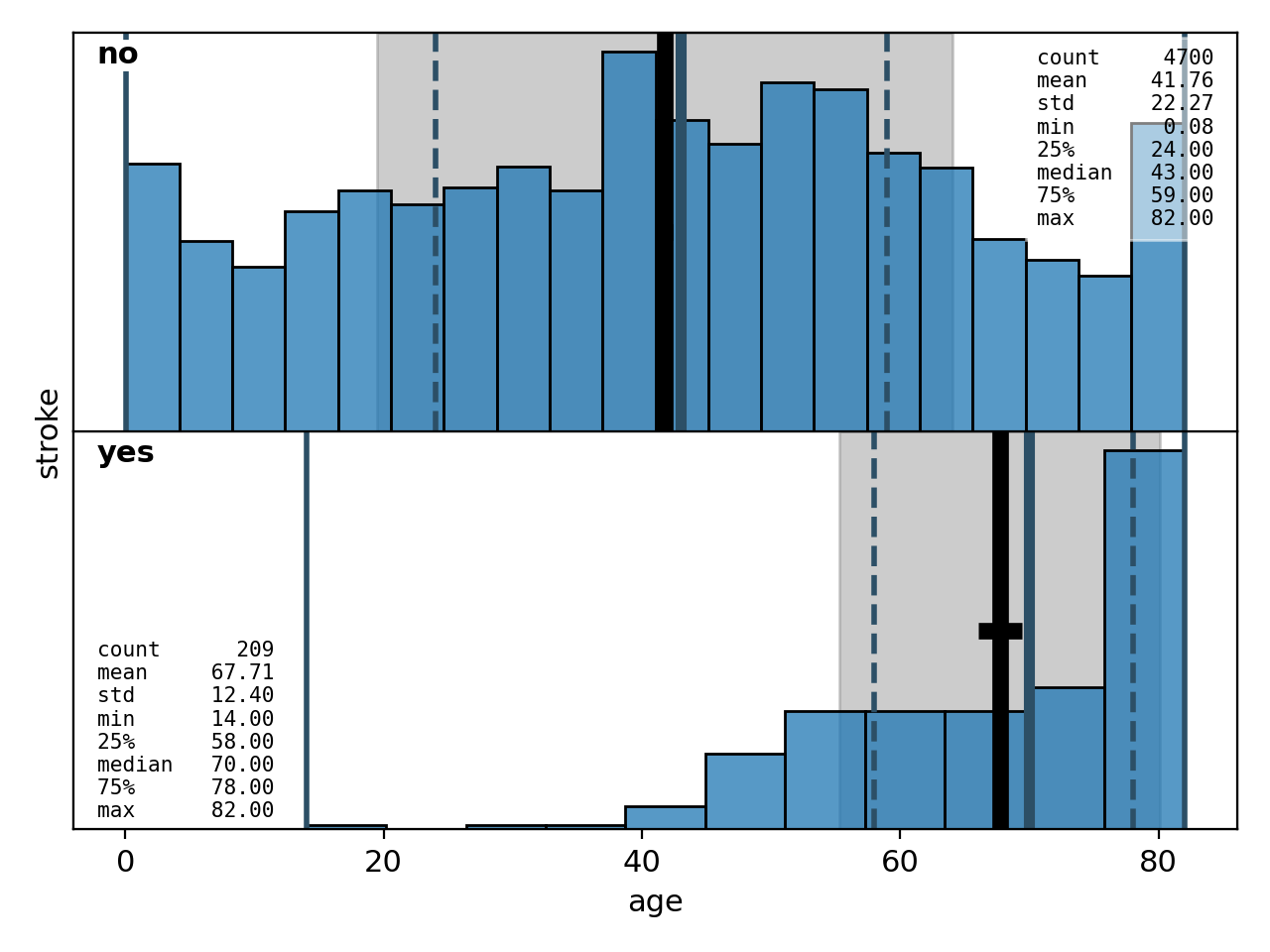
Figure 17: bivariate histogram with descriptive statistics included# |
Now let’s plot the correlations of all feature variables with the target. Correlations between categorical values on both the x-axis and the y-axis are shown as heatmaps. Here, we first plot the correlation with absolute numbers in the heatmaps, and then normalised along the columns:
# absolute values
fig = sb.plot.plot_grid_2D(nrows=2, ncols=5, data=data, xs=features, ys=target)
sb.plot2D.heatmap_set_annotations_fontsize(
    ax=fig.get_axes()[7], fontsize='x-small')
sb.plot2D.heatmap_set_annotations_fontsize(
    ax=fig.get_axes()[15], fontsize='small')
sb.plot.save(fig, 'corrs-absolute.png')

# relative values
fig = sb.plot.plot_grid_2D(
    nrows=2, ncols=5, data=data, xs=features, ys=target, relative='true')
sb.plot2D.heatmap_set_annotations_fontsize(
    ax=fig.get_axes()[7], fontsize='x-small')
sb.plot2D.heatmap_set_annotations_fontsize(
    ax=fig.get_axes()[15], fontsize='small')
sb.plot.save(fig, 'corrs-relative.png')
The resulting plots are shown in Figure 18 and 19:
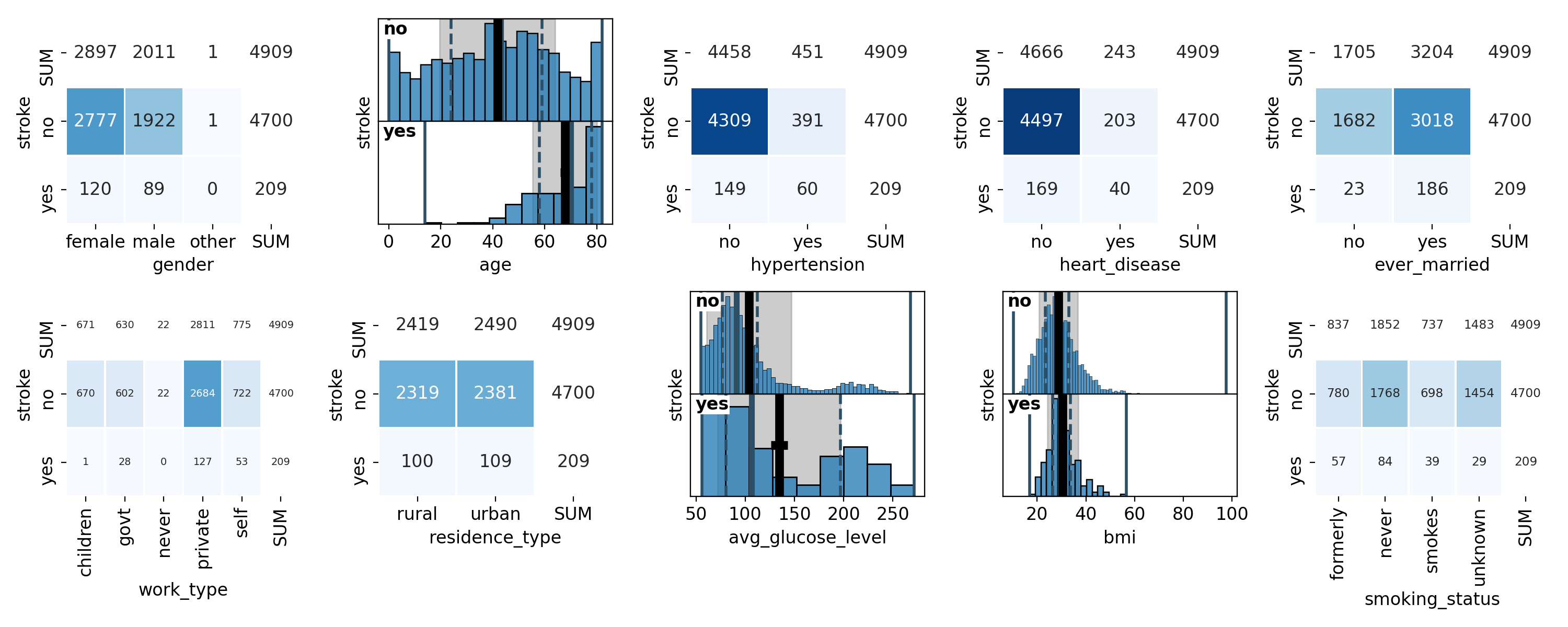
Figure 18: Correlations with absolute numbers in the heatmaps# |
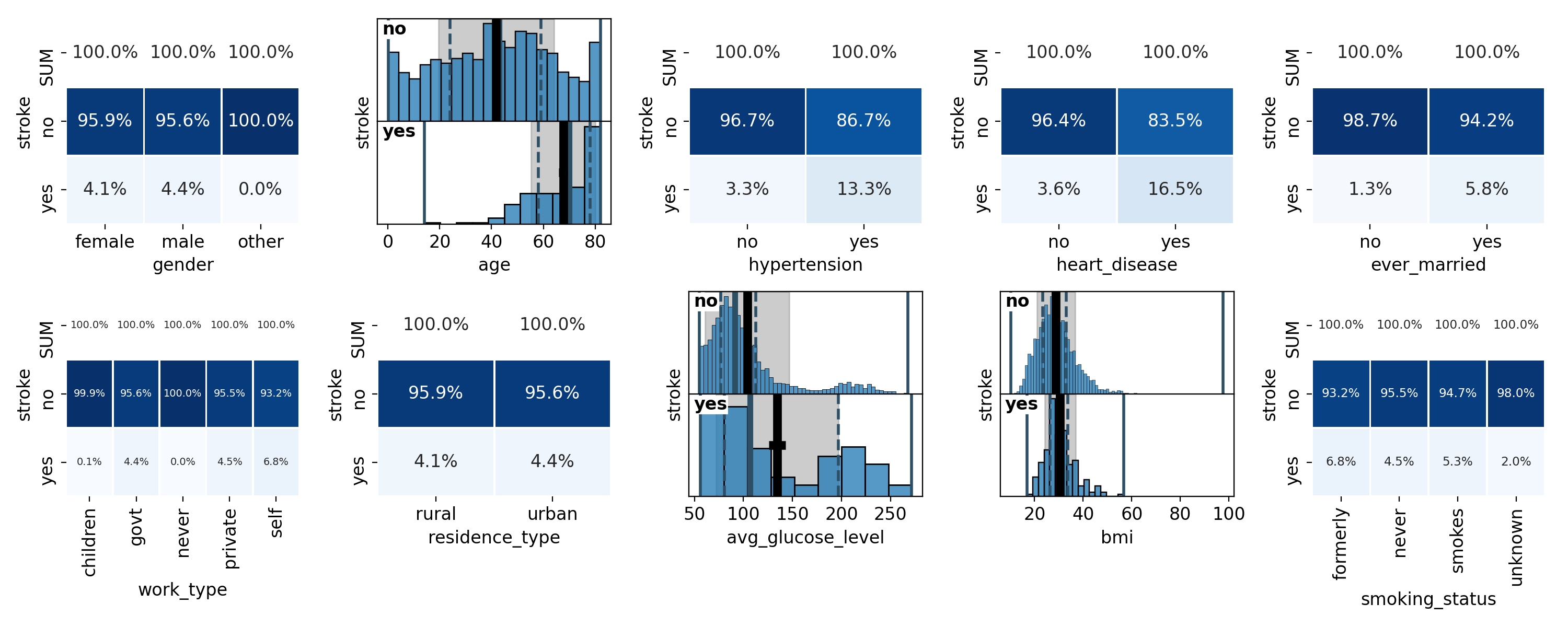
Figure 19: Correlations with heatmaps normalised along the columns# |
As you see in the code snippet, we are adjusting the fontsize in the cells of
some of the heatmaps with the
spellbook.plot2D.heatmap_set_annotations_fontsize() function.
In order to do this, we have to point it to the correct
matplotlib.axes.Axes object. Each grid plot has one axes in each
of the grid cells. Additionally, categorical histograms have one axes
object for each category. Therefore, the grid cell showing the
stroke-work_type correlation (bottom left) has the index 7 and
stroke-smoking_status correlation (bottom right) the index 15.
Looking at the correlations shown in the plots, we can see that men and women have about the same stroke rate - the small difference of 0.3% is likely not significant. Strokes are more likely with increasing age and show correlations with hypertension and heart conditions. Curiously enough there is a correlation between the presence of a stroke and the marriage status. But we should not confuse correlation and causation here - strokes are probably not due to marriages or divorces, at least not entirely, and this correlation is likely a consequence of the correlation between marriage status and age and the correlation of age with the stroke rate - or rather the underlying causal relation between declining health and increasing age. Regarding the type of work, self-employed patients seem to have a slightly higher stroke rate than people working in the private sector or government jobs. For children and people who have never worked, the stroke rate is practically zero, which again is likely to be a consequence of their young age. Residence type and BMI show no correlations with the presence of strokes while for the average glucose level, the secondary peak seems to be a tad more pronounced among stroke patients. Finally, former and current smokers seem to show a slightly elevated stroke rate - however, the statistical significance of these numbers is not large. It is also curious that the stroke rate is least among patients for which the smoking habits are not known. Since no options other than smokes, formerly and never come to mind, I would have expected this category to show similar stroke rates as the others. Given that the unknown category contains as many patients as the former and smokes categories combined, its lower stroke rate is indeed statistically significant which makes a statistical fluctuation unlikely.
sb.plot.save(sb.plot.plot_2D(data=data, x='age', y='ever_married'),
    filename='corr-married-age.png')
sb.plot.save(sb.plot.plot_2D(data=data, x='age', y='work_type'),
    filename='corr-work-age.png')
This snippet generates plots of the correlations between age and marriage status (Figure 20) as well as age and type of work (Figure 21). As mentioned in the last paragraph, these do show correlations and are likely the deeper reason for the correlations between marriage status, work type and strokes.
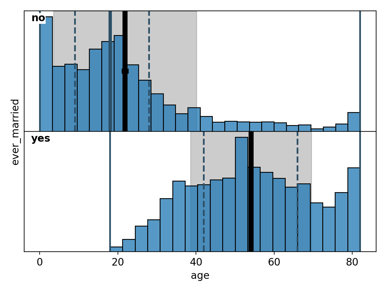
Figure 20: Correlation between marriage status and age# |

Figure 21: Correlation between work type and age# |
Finally, pairplots are a handy tool for showing the correlations between all possible combinations of variables along with the individual distributions of each variable. In spellbook, it is possible to plot both all correlations, resulting in a square plot grid, but also subsets of all possible correlations, with different variables on the x- and y-axes, resulting in rectangular plot grids. Examples for both options are:
# 3x5 pairplot
vars = ['ever_married', 'age', 'hypertension', 'heart_disease', 'bmi', 'stroke']
pairplot = sb.plot.pairplot(data, xs=vars[:5], ys=vars[1:4])
sb.plot.save(pairplot, 'pairplot-3x5.png')

# full pairplot of all features
sb.plot.save(
    sb.plot.pairplot(data, xs=features),
    filename='pairplot-features.png', dpi=100)
For the full pairplot, the resolution was decreased to 100dpi to keep the filesize at bay. The resulting plots are shown in Figures 22 and 23:
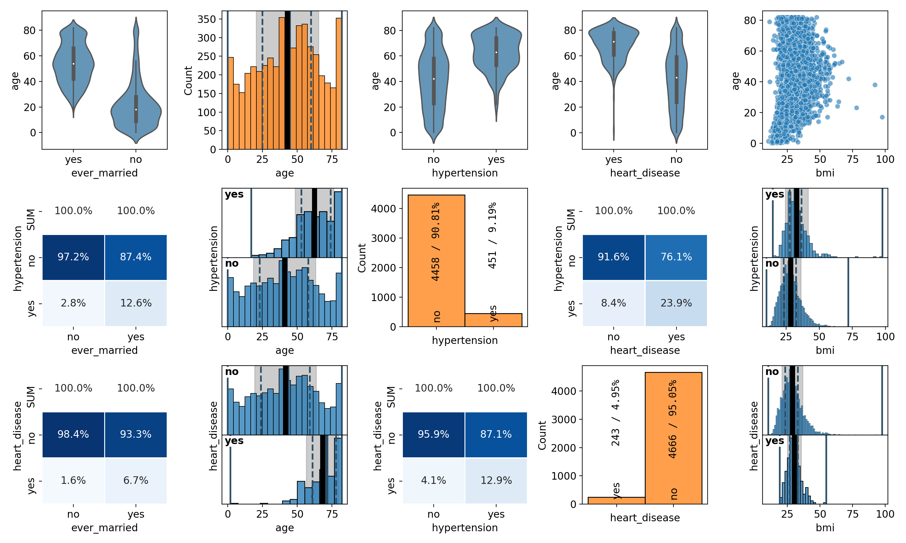
Figure 22: 3x5 pairplot of a subset of the features# |
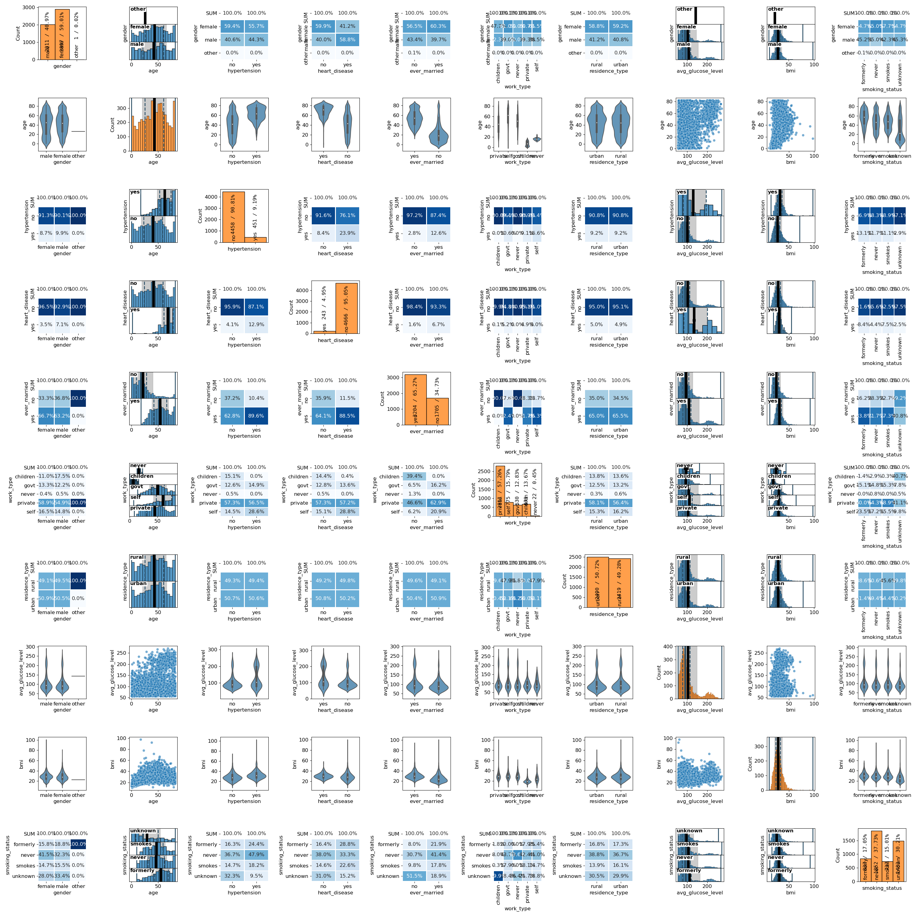
Figure 23: Full paiplot for all features# |